As you can see colors on the web are changing, for years dark more sophisticated color sets ruled. Now, most colors are friendly and lighter as you can see most with Twitter and Skype.
So the question is do the traditional rules of what colors mean to sell products still apply?
I think the answer is a little.
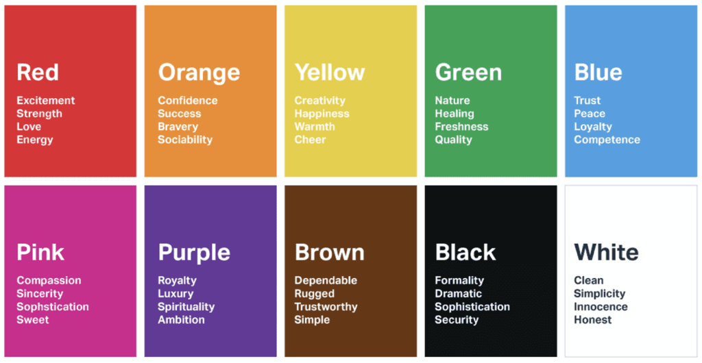
For a quick refresher here is what colors used to mean through emotion:
Black – space, night, authority
Blue – sky, water, travel, freedom, truth
Brown – wood, comfort, strength
Green – money, calm, envy, greed
Orange – autumn, youthfulness, fire
Pink – romantic, affection, sensuality
Purple – royalty, dignity
Red – love, excitement, warmth
White – purity, peace, perfection
Yellow – light, purity, understanding
Red symbolizes utter devotion and loyalty
Purple embodies fortitude and resourcefulness
Black manifests faithfulness and integrity
White implies craft
Blue represents valor and vigor
Green signifies justice and chivalry
Yellow exemplifies cruelty
Dark red is reserved for loyal old generals.
Golden and Silver are used for Buddha, gods, ghosts, and demons.
And for selling products or marketing this is what they used to mean:
Psychology of Color: Black
Black is the color of authority and power, stability and strength. It is also the color associated with intelligence (doctorate in black robe; black horn-rimmed glasses, etc.) Black clothes make people appear thinner. It’s a somber color sometimes associated with evil (the cowboy in the black hat was almost always the “bad guy”). In the western hemisphere, black is associated with grieving. Black is a serious color that evokes strong emotions; it is easy to overwhelm people with too much black.
Psychology of Color: White
For most of the world, this is the color associated with purity (wedding dresses); cleanliness (doctors in white coats), and the safety of bright light (things go bump in the night … not the bright sunshine!). It is also used to project the absence of color or neutrality. In some eastern parts of the world, white is associated with mourning. White is associated with creativity (whiteboards, blank slates). It is a compression of all the colors in the color spectrum.
Psychology of Color: Gray
Gray is most associated with the practical, timeless, middle-of-the-road, solid things in life. Too much gray leads to feeling mostly nothing; but a bit of gray will add that rock-solid feeling to your product. Some shades of gray are associated with old age, death, taxes, depression, or a lost sense of direction. Silver is an off-shoot of gray and is often associated with giving a helping hand, and having strong character (sterling in fact!).
Psychology of Color: Red
If you want to draw attention, use red. It is often where the eye looks first. Red is the color of energy. It’s associated with movement and excitement. People surrounded by red find their hearts beating a little faster and often report feeling a bit out of breath. It’s absolutely the wrong color for a baby’s room but perfect to get people excited. Wearing red clothes will make you appear a bit heavier and certainly more noticeable. (Some studies show red cars get more tickets but that may be because the red car owners drive faster or the ticket giver notices the movement of the red car more prominently). Red is not a good color to overuse but using a spot of red in just the right place is smart in some cases (one red accent in an otherwise neutral room draws the eye; a red tie with a navy blue suit and white shirts adds just the right amount of energy to draw the eye (no wonder it’s the “uniform of the day” at the seats of government). Red is the symbol of life (red-blooded life!) and, for this reason, it’s the color worn by brides in China. Red is used on holidays that are about love and giving (red roses, Valentine’s hearts, Christmas, etc.) but the true color of love is pink. Pink is the most calming of all colors — often our most dangerous criminals are housed in pink cells as studies show that color drains energy and calms aggression. Think of pink as the color of romance, love, and gentle feelings, to be in pink is to be soothed.
Psychology of Color: Blue
Ask people their favorite color and a clear majority will say blue. Much of the world is blue (skies, seas). Seeing the color blue actually causes the body to produce chemicals that are calming, but that isn’t true of all shades of blue. Some shades (or too much blue) can send a cold and uncaring message. Many bedrooms are blue because it’s a calm, restful color. Over the ages, blue has become associated with steadfastness, dependability, wisdom, and loyalty (note how many uniforms are blue). People tend to be more productive in a blue room because they are calm and focused on the task at hand. Some studies are showing that weight lifters can lift more weight in a blue gym – in fact, nearly all sports are enhanced in blue surroundings.
Psychology of Color: Green
The color of growth, nature, and money. A calming color also that’s very pleasing to the senses. Dark forest green is associated with terms like conservative, masculine, and wealth. Hospitals use light green rooms because they too are found to be calming to patients. It is also the color associated with envy, good luck, generosity, and fertility. It is the traditional color of peace, harmony, comfortable nurturing, support, and well-paced energy.
Psychology of Color: Yellow
Cheerful yellow the color of the sun is associated with laughter, happiness, and good times. A person surrounded by yellow feels optimistic because the brain actually releases more serotonin (a feel-good chemical in the brain) when around this color. It is the color associated with optimism but be careful with yellow, when intense, it is the color of flames and studies show babies cry more in (bright) yellow rooms and tempers flare more around that color too. It has the power to speed up our metabolism and bring out some creative thoughts (legal tablets are yellow for good reason!). Yellow can be quickly overpowering if over-used, but used sparingly in just the right place it can be an effective tool in marketing to greater sales. Some shades of yellow are associated with cowardice; but the more golden shades with the promise of better times.
Psychology of Color: Orange
The most flamboyant color on the planet! It’s the color tied to most of these fun times, happy and energetic days, warmth, and organic products. It is also associated with ambition. There is nothing even remotely calm associated with this color. Orange is associated with a new dawn in attitude.
Psychology of Color: Purple
What color were the robes of kings and queens? Yes, they were purple, our most royal color that is associated with wealth, prosperity, and rich sophistication. This color stimulates the brain activity used in problem-solving. However, when overused in a common setting it is associated with putting on airs and being artificial/ Use purple most carefully to lend an air of mystery, wisdom, and respect. Young adolescent girls are most likely to select nearly all shades of purple as their favorite color.
Psychology of Color: Brown
This color is most associated with reliability, stability, and friendship. More are more likely to select this as their favorite color. It’s the color of the earth itself “terra firma” and what could represent stability better. It too is associated with things being natural or organic. Caution, however, for in India it is the color of mourning.
How to choose a color Schemes That Suit Your Website Best:
How do you choose a color scheme for your web page? Most computer users will start with a basic color. If you have a logo you may want to use one of the existing colors within your logo. If you have a title or header already designed you can select a color from within this design. This will help blend your page together and can often give a more professional look to your site.
Using a color scheme selector can help you choose the right colors for your website and give you the look you’re seeking. To use a color selector you will first need a basic color to start with. For example, let’s say that part of your logo is blue and you think a blue web page will work well for your type of business. A selector will give you the option to choose a complimentary color, analogic colors, monochromatic or contrasting, among others.
Orange is found to be a complementary color to blue. Several shades of blue and several of orange may be just what you’re looking for when it comes to the perfect color scheme. Though you may feel satisfied with complimentary colors, try another scheme just to see if it happens to work better for you. Often those designing their own website will start out using monochromatic colors, such as many shades of blue, and find that their pages are pleasing but that nothing stands out.
Changing to an analogic (base color, neighbor, and complimentary) scheme may help solve this problem. With this selection, you will have complimentary colors along with a neighboring color such as blues, greens, and orange shades. Use one of these shades sparingly for added interest that will bring attention to the areas you want it. Remember that using neighboring colors (blue and green) will be a more subtle look than complimentary colors (blue and orange).
Triadic color schemes are often used on children’s pages or websites that want a lot of contrast. The triadic scheme for blue would be blue, yellow, and red. Using one main color on a larger amount of the page, perhaps the background will help keep your web page design looking professional. Remember that too much contrast may be too much of a good thing.
Adding a bright color sparingly may be what you’re after when you want something to stand out, such as a link or a specific word on your page. It’s not recommended to type up all the text in a brightly contrasting color (red on blue). This makes it hard and annoying to read. A deep blue background with red and yellow links may look great on a preschool site but probably wouldn’t be best on a serious site such as a lawyer’s business site. Stick with black text unless you have a word or two that you’d like to stand out.
Choose your colors wisely. Sticking with the colors in your logo or header is a sure winner. Adding a contrasting or a simple complementary color can help your web page look professional and appealing. Don’t forget that your website will make that first impression on visitors, so make sure it’s a great one.

